Alright, buckle up, folks! Today, we’re diving into one of the most mystifying, nerve-wracking decisions you’ll ever make in your professional life—choosing an animation style. Yep, it’s right up there with picking your kid’s name or deciding whether pineapple belongs on pizza (spoiler: it totally does). So if you’ve ever found yourself drowning in a sea of 2D, 3D, stop-motion, and who-knows-what-else animations, you’re in the right place. Grab some popcorn, take a deep breath, and let’s figure this out together…without needing a therapist by the end.

1. “So Many Styles, So Little Sanity!”
Have you ever stood in front of a menu with way too many options? You’re starving, but the sheer number of dishes has you questioning your life choices. Choosing the right animation style for a project is kind of like that. Only now, instead of picking between burgers and tacos, you’re staring down a list of animation styles: 2D, 3D, whiteboard, motion graphics, explainer, stop-motion—oh my! And sure, they’re all delicious in their own way, but which one’s going to hit that sweet spot for your brand?
2. “Why 2D and 3D Are Not Just Dimensions… They’re a Lifestyle Choice”
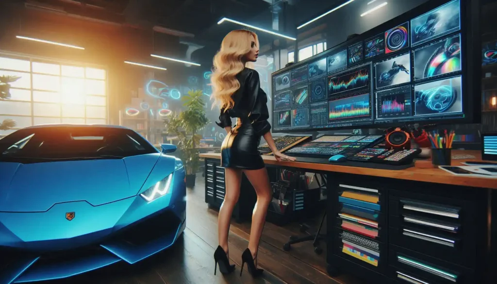
Imagine you’re building a product that’s the tech equivalent of a luxury sports car. Now, if you’re thinking you’ll save a few bucks with simple 2D illustrations, you might as well slap stick figures on the promo. But if you go 3D, you’ll have all those juicy angles, those curves, that “WOW, is this real?” vibe. Of course, with all that 3D goodness, you’re investing a bit more time and cash, so save it for when you really need that eye-catching glam factor!
3. “Motion Graphics: The Jazz Hands of Animation”
Here’s the deal with motion graphics: it’s not your everyday animation—it’s animation with flair. Got a message that needs a little pizzazz but doesn’t want to blow the budget? Motion graphics are your jam. Think of them as the jazz hands that bring text, icons, and simple shapes to life. It’s simple, classy, and still makes an impact without overstepping its bounds, like that friend who always brings the perfect snack to the party.
4. “Explainers: Your Friendly, Neighborhood Narrators”
Let’s say you have a complex service that needs explaining, like how cryptocurrency works or how to fix a leaky faucet (but let’s be honest, who actually wants to fix a leaky faucet?). That’s where explainer videos come in. They’re like your friendly neighbor who comes over and says, “Alright, let me break it down for you.” Just make sure it’s done in a way that doesn’t leave the audience feeling like they’ve been hit over the head with too much information—or worse, bored to tears.
5. “Whiteboard Animations: When You’re Going for That ‘Aha!’ Moment”
Remember those “lightbulb” moments back in school? You know, when the teacher scribbled something on the board, and suddenly, math made sense? Whiteboard animation is like that. It’s great for education, training, or anywhere you want to take someone from ‘huh?’ to ‘aha!’ in two minutes or less. Plus, watching things come to life on a whiteboard has this oddly satisfying feel—like watching Bob Ross paint a forest of happy little trees.
6. “Stop-Motion: For When You’re Feeling Artsy… and Patient”
Ah, stop-motion—the grandma of animation styles. It’s quirky, it’s nostalgic, and it takes a lot of patience. But if you’ve got an artsy vibe or a product that deserves a handcrafted touch, stop-motion can be worth every painstaking frame. Just know this: you’re in for a long ride. Every scene, every frame, every little tweak will need to be manually set up, but oh, the charm is unbeatable.
7. “Choosing Your Style Based on Budget: Caviar or Chips?”
Alright, let’s get real—style isn’t the only factor here; there’s also the matter of what your wallet can handle. If you’re on a champagne budget, go for that sleek 3D or maybe even some high-end motion graphics. On a more modest budget? 2D or whiteboard animations are both impactful and affordable. Basically, don’t break the bank trying to make your video look like an Oscar contender when all you need is something snappy and effective.
8. “The Golden Rule: Know Thy Audience”
Now, here’s the biggie: know who you’re talking to! Are you targeting kids who would love vibrant colors and fun characters? Or a corporate crowd that wants no-nonsense, clean graphics? It’s like picking an outfit for a date—your style should say, “I get you.” So, before you start dreaming up an animation style, think about what your audience wants to see. Because at the end of the day, it’s about making them feel something, not just giving them eye candy.
9. “The Bottom Line: It’s All About the Message”
Here’s the secret sauce to choosing the right animation style that works: it all comes down to the message. Animation isn’t a one-size-fits-all kind of thing. So, figure out what you want to say, then pick the style that amplifies that message. Because, trust me, nothing’s worse than having a killer animation that completely misses the mark on what you’re actually trying to communicate.
Ready to bring your ideas to life with the perfect animation style? At Next Animation, we specialize in crafting custom 2D, 3D, and motion graphic animations tailored to your brand’s unique needs. Whether you’re looking for a high-energy explainer or a sleek, cinematic experience, our team is here to guide you every step of the way. Let’s make your vision unforgettable! Reach out today, and let’s discuss how we can create the perfect animation for your project.
In the end, picking an animation style is kind of like dating—explore your options, know what fits, and go with the one that makes you look (and feel) amazing. And if all else fails, remember: you can never go wrong with a little jazz hands.


