Ever been in a meeting where someone said, “Can you just slip the Animation Logos Fonts in there? No big deal, right? Well, as an animator, you know it’s never that simple. They really mean: “Can you make the logo bigger, more subtle, somehow glow like the Northern Lights, and yet still match our corporate vibe?”
Fonts: The Unsung Heroes of Brand Identity
Let’s talk fonts. Your brand’s fonts are like the socks you never think about—until you realize you’re wearing one red and one blue sock to a business meeting. Ever try to sneak in a generic font when the brand’s signature font isn’t available? Oh no, people notice. Using the wrong font in animation is like sending a text in Comic Sans—people will forgive many things, but not that.
Color Me Brand-Worthy
Now, the colors. Oh, the colors. Brands have these specific, sacred hex codes like they were handed down from the graphic design gods. But have they ever realized that translating their perfect shade of “Sunset Orange” to animation can sometimes make the screen look like an Oompa Loompa exploded? Getting those exact brand colors into animation is basically digital alchemy. Sometimes, I feel like I should be wearing a lab coat and goggles while adjusting hues.
The Logo: It’s Not a Sticker, It’s a Lifestyle
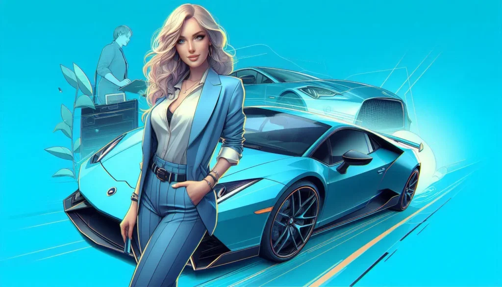
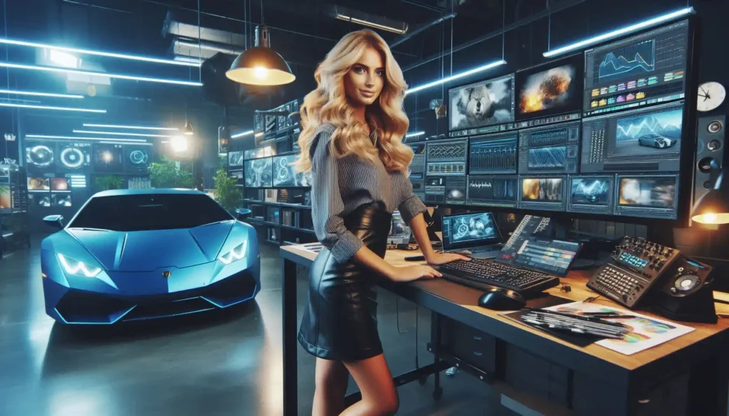
Let’s get back to logos—because, honestly, they demand center stage. It’s like the logo is the Beyoncé of brand assets, and everything else is just backup dancers. But here’s the thing: no one wants their Beyoncé logo just slapped on there. They want it subtly animated, but not too subtle. Shiny, but not tacky. Visible, but not in-your-face. So now, it’s up to us to make it look like it just casually appeared in the animation—like it’s been there all along, blending perfectly into the visual symphony.
“Can’t You Just… You Know, Animate It?”
And then comes the kicker—the moment the client says, “Oh, can’t you just, you know, make it move?” Sure, I’ll just have the logo tap dance across the screen while maintaining brand dignity and a corporate-friendly two-step. No pressure. It’s not like they’re asking me to blend creativity, technical skill, and years of animation know-how to make a rectangle with text come alive with personality. Oh wait, yes, that’s exactly what they’re asking for.
The Brand Guide: AKA the Holy Grail
Ah, the brand guide. This isn’t just a set of instructions, it’s a religious text. Deviate from it, and you might as well be excommunicated from the Church of Brand Consistency. “No, no, no! The logo can’t be that close to the edge, it violates the sacred 15-pixel margin!” Suddenly, I’m less of an animator and more of an archaeologist, carefully dusting off the brand assets and making sure I don’t violate any ancient laws of design.
Why Do We Do This to Ourselves?
So why do we go through all this trouble? Why not just slap a generic font, random colors, and a stock logo and call it a day? Because deep down, we know that every brand is unique, and the details matter. Animation is more than just making things move—it’s about making them move in a way that screams, “This is us!” Integrating logos, fonts, and brand colors into animation is like creating a visual fingerprint. No two animations should look the same, just like no two brands should.
Final Curtain Call: The Big Reveal
At the end of the day, when the client sees their logo effortlessly spinning into place, their fonts dancing elegantly across the screen, and their brand colors glowing just right, they look at us like we’ve performed some kind of digital sorcery. They clap, they cheer, and then… they ask if we can make one tiny change.
Encore: One More “Tiny” Change
Ah yes, the classic “tiny” change. My personal favorite. It’s like being asked to repaint the Mona Lisa’s smile because “it’s a little off.” But hey, that’s part of the fun, right? After all, we didn’t become animators because we liked things to be easy. We do it because nothing beats the satisfaction of seeing a brand come alive in a way that makes it unforgettable—and maybe, just maybe, getting to say “done” after that last tiny tweak.
There you have it—integrating brand assets into Animation Logos Fonts may feel like walking a tightrope over a pool of client requests, but when done right, it’s pure magic. Just make sure you bring your wand… and maybe an extra 15-pixel margin buffer.