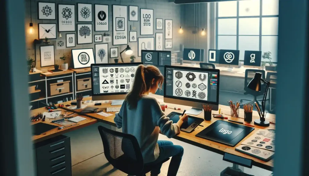
Why You Need a Business Logo: 20 Tips and Tricks. A logo is more than just a small piece of artwork; it’s the foundation of your brand identity, a visual representation of your business that conveys your essence, values, and ambitions. Here, we delve into why a business logo is vital and share 20 essential tips and tricks to guide you in creating a logo that not only stands out but also supports your brand’s growth and success.

Alright, folks, let’s talk logos. But not just any logos. I’m talking about animated logos—the ones that don’t just sit there like they’re waiting for a bus, but come alive and practically shout, “Look at me!”
1. Static Logos? That’s So Last Decade
Here’s the deal: static logos had a good run. They were the go-to for businesses everywhere. But in today’s fast-paced, attention-deficit digital world, a logo that just sits there… well, it’s like showing up to a dance party and refusing to leave your chair. Boring. Your audience is scrolling through their feeds like they’re running a marathon, and if your logo isn’t moving, they’re probably not stopping to look.
2. Enter the Animated Logo: Your Brand’s First Impression
Think of your logo as your business’s handshake. Now imagine that handshake is accompanied by jazz hands. That’s what an animated logo does! It turns heads, catches attention, and leaves a lasting impression in a sea of sameness. I mean, when was the last time a customer said, “Oh wow, I just love that motionless, unexciting logo”? Exactly.
3. Grab That Short Attention Span
I’m talking “scroll, scroll, scroll, ooh—what’s that?” levels of attention. That’s why your logo needs to do more than just exist. It needs to move. With an animated logo, you’re grabbing those precious milliseconds of attention. You know, the difference between someone sticking around and someone swiping left on your brand like a bad dating profile.
4. Brand Recognition – Supercharged!
You want your logo to be memorable, right? Well, nothing sticks in someone’s mind like a logo that zips, swirls, and flashes with personality. It’s like that friend who tells a great joke—you remember them! Animated logos give your brand a unique flair that sticks with your audience. It’s the secret sauce that helps your business stand out in the crowded market.
5. Motion Equals Emotion
Let’s get a bit deep here. Motion creates emotion. Think about it: a static image can only communicate so much, but when your logo moves? It tells a story. It gives your brand personality, energy, and vibe. Whether it’s a subtle swoosh, a clever reveal, or a full-on explosion of color, an animated logo creates a connection with your audience. And that connection? Yeah, it’s priceless.
6. Trust Me, Your Competitors Are Already Doing It
Now, let me tell you this—if you think animated logos are just a trend, think again. Big brands are already on this bandwagon, and they’re riding it all the way to the bank. You don’t want to be the last business still clinging to a static logo like it’s your grandma’s old dial-up internet. This is the digital age, people! Time to level up.
7. Perfect for All Platforms
Here’s another reason to animate that logo of yours: it works everywhere. Website intros? Nailed it. Social media? A showstopper. Email signatures, presentations, YouTube intros—it’s like your animated logo is the life of the party, and every platform is its stage. And let’s face it, people are way more likely to remember a business when its logo does more than just sit there.
8. Cost-Effective Marketing Magic
Still on the fence because you think it’s going to cost an arm and a leg? Think again. An animated logo is a one-time investment that you can use over and over again. It’s like a Swiss army knife for your brand’s marketing. A polished, professional animated logo instantly boosts your business’ credibility and gives your marketing materials that extra oomph.
9. The Future Is Moving
The world is in motion, and so is design. The future isn’t just static; it’s dynamic, it’s alive, and your brand has to keep up. Animated logos aren’t just a “nice to have” anymore—they’re quickly becoming a must-have. And the best part? They’re fun! Who wouldn’t want to see their brand come to life like that?
10. So Why Haven’t You Animated Your Logo Yet?
Look, I get it. Change can be scary. But here’s the thing: an animated logo isn’t just a gimmick. It’s a game-changer. It’s the difference between blending into the background and standing out as a bold, memorable brand.
So, if you’re ready to bring your logo—and your brand—to life, let’s get moving! Because in a world full of noise, an animated logo makes sure your business gets heard… and seen!
The Importance of animated Logo
First Impressions Matter: Your logo is often the first point of contact with potential customers, setting the tone for all your brand interactions.
Brand Identity: A well-designed logo communicates your business’s personality and values, helping to build a comprehensive brand identity.
Recognition: Logos make your brand more recognizable, fostering brand loyalty among your customers.
Professionalism: A professional logo reflects a professional business, increasing trustworthiness and credibility.
Stand Out: In competitive markets, a distinctive logo can differentiate you from competitors, highlighting your unique selling propositions.
20 Tips and Tricks for an Effective Animation Logo
Planning and Strategy
Understand Your Brand: Before designing, deeply understand your brand’s core values, mission, and target audience.
Research the Competition: Analyze competitors’ logos to ensure your design stands out while still aligning with industry expectations.
Simplicity is Key: A simple logo design is more recognizable and easier to remember.
Versatility: Ensure your logo looks good on different platforms and sizes, from business cards to billboards.
Color Psychology: Use colors strategically to evoke the right emotions and convey your brand message.
Design Process
Typography Matters: Choose a font that complements and enhances your logo’s design and readability.
Be Original: Avoid clichés and generic designs to ensure your logo is memorable and unique.
Use Negative Space: Clever use of negative space can add depth and a hidden message to your logo.
Focus on Scalability: Design a logo that maintains its integrity and effectiveness when scaled to any size.
Consider the Logo’s Future: Design with the future in mind, ensuring your logo can evolve with your brand.
Refinement and Evaluation
Feedback Loop: Seek feedback from diverse groups to get different perspectives on your logo’s design.
Black and White First: Designing in black and white ensures your logo is effective without relying on color.
Avoid Trends: Trendy logos can quickly become outdated. Aim for a timeless design.
Balance and Proportion: Pay attention to the balance and proportion of your logo to ensure it’s aesthetically pleasing.
Emotional Connection: Strive to create a logo that resonates emotionally with your target audience.
Implementation and Usage
Consistent Branding: Use your logo consistently across all marketing materials to build brand recognition.
Protect Your Logo: Consider trademarking your logo to protect it from unauthorized use.
Digital Optimization: Optimize your logo for digital use, ensuring it looks great on websites and social media platforms.
Adaptability: Be prepared to update your logo as your business grows and evolves.
Invest Wisely: Consider your logo as an investment in your brand’s future, not just a cost.
Conclusion
A business logo is a critical asset that serves multiple roles: it’s a mark of authenticity, an emblem of your brand’s values, and a tool for differentiation. By following the above tips and tricks, you can create a logo that not only captures the essence of your business but also positions your brand for long-term success. Remember, a great logo is at the heart of a great brand, and investing in your logo is investing in your business’s future.


