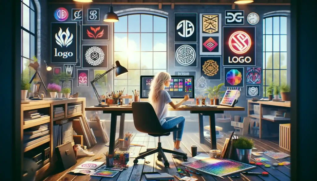
Alright, folks. Let’s talk about animated logos. You know, those flashy, moving little icons that are supposed to make people go, “Wow!” but often end up making them go, “What… is this?” It’s not about throwing some random shapes in motion and calling it a day. It’s about creating a visual masterpiece that moves with purpose. So, today, I’m giving you the top 10 ideas for designing animated logos that—wait for it—don’t suck.
1. Keep It Simple (Seriously, Don’t Overthink It)
Let’s start with the basics. When it comes to animated logos, simplicity is your best friend. Trust me, no one needs to see your logo doing cartwheels, splits, and backflips all at once. If your logo looks like it’s auditioning for a Cirque du Soleil show, you’ve gone too far. A simple reveal, a gentle fade-in, or even a subtle spin can be all you need. Think elegance, not chaos. You want people to be impressed, not confused.
2. Tell a Micro Story
Ever watched a great animated logo and felt like it told you a little story in just a few seconds? That’s the magic. You don’t need a full-blown narrative, but a beginning, middle, and end can make your logo memorable. Maybe your logo slowly assembles piece by piece or subtly transforms into something recognizable. Just don’t try to turn it into a mini feature film—unless you’re Pixar, keep it snappy.
3. Use Movement to Reflect Your Brand’s Personality
You know how some people say you can tell a lot about someone by the way they walk? Same deal with your animated logo. The movement should reflect your brand’s vibe. If you’re a cutting-edge tech company, maybe your logo glides in smoothly, like it’s powered by AI. If you’re a fun, quirky brand, maybe it bounces into place like it’s had one too many coffees. Just remember, the animation should feel like it belongs to your brand—not like you borrowed it from a random TikTok tutorial.
4. Incorporate Shape Shifting (The Cool Kind)
Alright, don’t get too excited—we’re not talking about your logo morphing into Optimus Prime. But a little shape-shifting can work wonders. Maybe your logo starts as one simple shape and then evolves into the full emblem. Or it could begin as a symbol and transform into your brand’s name. It’s like giving your audience a puzzle to solve, but without making them feel like they need a PhD to figure it out. Just remember, keep it smooth. If it looks like your logo is glitching out, that’s not shape-shifting, that’s a design emergency.
5. Leverage Negative Space (Because Less Is More)
Negative space in logo design is like that person at a party who doesn’t talk much but when they do, they drop absolute wisdom bombs. In animation, it’s no different. Use negative space to reveal elements of your logo in a clever way. Maybe the movement of one shape creates an entirely new design in the negative space. It’s subtle, it’s smart, and it’ll make people feel like they’ve discovered a little secret in your logo. And who doesn’t love a good secret?
6. Play with Timing (Fast, Slow, Then Whoa!)
Now, here’s the thing—timing is everything. You’ve got to decide when and how fast things move. A logo that rushes through its animation like it’s late for a meeting? That’s just stressful to watch. On the flip side, if your logo crawls along like it’s stuck in molasses, people will check out before the magic happens. The trick is to mix up your timing. Start slow, speed it up, then hit them with a final smooth flourish. It’s like telling a joke—you want that punchline to land perfectly.
7. Give It a Purposeful Entrance and Exit
Your logo shouldn’t just appear like, “Hey, I’m here!” No, your animated logo needs to make a grand entrance and a smooth exit. Think of it like the logo equivalent of a Hollywood star walking down the red carpet. It’s gotta arrive with style and leave with a lingering impression. Whether it’s fading in softly, zooming in, or assembling like a puzzle, give it an entrance that’s worth remembering—and an exit that feels complete.
8. Use Color Transitions (But Don’t Go Full Rainbow)
Color transitions can make your logo pop in a way that a static design just can’t. But let me be clear: this is not permission to turn your logo into a 1990s screensaver. A subtle gradient shift, or a color reveal that emphasizes part of your design, can make all the difference. It’s like your logo is coming to life right before your eyes. Just don’t overdo it. Too many colors and you’ve gone from sophisticated to Skittles real quick.
9. Add a Bit of Surprise
You know what people love? Surprises. And I’m not talking about surprise parties (unless you’re into that), but little unexpected elements in your logo animation. Maybe a small part of the design does something playful—like a dot bouncing into place or a line sliding in with a satisfying click. These little surprises make your logo more memorable and fun to watch. Just make sure the surprise is subtle—no one’s expecting fireworks here, just a well-timed “Oh, that’s cool!”
10. Think Beyond the Screen (3D for the Win!)
Alright, we’re taking it up a notch—3D animations. If you’re feeling adventurous, why not add a little dimension to your logo? It can rotate, shift, or give the illusion of depth that makes it feel more alive. You don’t want your logo to feel like it’s auditioning for the next Transformers movie. Just a little 3D magic to make it feel more dynamic. Trust me, people will notice the difference.
And there you have it! Ten ideas to make sure your animated logo doesn’t suck. Remember, it’s not just about making things move—it’s about moving with purpose. Whether it’s telling a mini-story, keeping it simple, or throwing in a dash of surprise, these tips will help you create a logo that’s not just good, but unforgettable. So go ahead, make your logo the rockstar it deserves to be. Just, you know, don’t make it do the moonwalk… unless that’s really your brand’s vibe.
Must-Try Ideas for Creating Animated Logos That Actually Work
Designing Ideas For Designing Logos that effectively encapsulate the essence of a brand while standing out in a crowded marketplace is a nuanced art. The creation of a logo goes beyond mere aesthetics; it’s about forging a visual identity that communicates a brand’s values, mission, and personality. Here’s an enhanced and more comprehensive guide to crafting logos that are not only unique but also resonate deeply with the intended audience.
11. Foundation in Brand Identity
Before putting pen to paper, immerse yourself in the brand’s identity. This means understanding the brand’s core values, mission, target audience, and unique selling propositions. A logo is a visual shorthand for the brand’s story; therefore, every element of the logo should be a reflection of these foundational aspects.
12. Embrace Simplicity with Purpose
The power of a logo often lies in its simplicity. Simple logos are not only timeless but also versatile and memorable. However, simplicity doesn’t mean your logo should be generic or devoid of meaning. Every curve, color, and font choice should serve a purpose and reflect some aspect of the brand.
13. Memorability Through Distinctiveness
A logo should capture attention and remain in the viewer’s memory long after they’ve seen it. Achieving this requires a balance between simplicity and unique elements that can spark recognition. Think about incorporating an unexpected twist or clever use of design elements that tell a story or convey a message about the brand.
14. Versatility Across Platforms
A great logo performs well across various applications and sizes—from the tiny icon on a smartphone app to the signage on a storefront. This demands a design that is scalable, legible, and impactful in both color and black and white. Consider the logo’s application on different materials and digital platforms during the design process.
15. Strategic Use of Color
Colors can evoke emotions, communicate messages, and influence perceptions. Choose colors that align with the brand’s personality and the psychological impact you wish to achieve. Additionally, it’s important to test the logo in various color environments to ensure it maintains its integrity and message across different backgrounds and contexts.
16. Typography That Speaks
The choice of font in a logo can significantly influence its character and readability. Custom typography can offer uniqueness and help your logo stand out. However, the font should also be functional, ensuring that the logo remains legible in different sizes and mediums.
17. Originality and Authenticity
In a world filled with logos, creating something truly original can be challenging. Avoid trends and clichés that might make your logo look dated in a few years. Instead, strive for a design that is authentically connected to the brand’s story and values, ensuring it stands out for the right reasons.
18. Future-Proofing Your Design
While it’s important to design a logo that feels current, it should also have the longevity to last as the brand grows and evolves. This means avoiding trendy design elements that may not age well and opting for a design that can adapt to future brand evolutions.
19. Iterative Design Process
Designing a great logo is rarely a straight path. It involves experimentation, iteration, and refinement. Gather feedback from a diverse group, including stakeholders, potential customers, and design professionals. Use this feedback to hone and improve the design.
20. Professional Insight
While there’s a plethora of DIY logo design tools available, the expertise of a professional designer or design team can be invaluable. They bring not only design skills but also an understanding of branding and market trends that can elevate a logo from good to exceptional.
Ideas For Designing Logos Conclusion
A logo is more than just a visual mark; it’s a symbol of the brand’s entire ethos. Achieving a logo that “doesn’t suck” is about blending creativity with strategy, simplicity with meaning, and uniqueness with universality. By focusing on the brand’s core identity, aiming for timeless simplicity, and engaging in a thoughtful design process, you can create a logo that effectively communicates the essence of the brand and makes a lasting impression. Remember, the goal is to craft a logo that not only stands out in today’s market but will also endure and adapt as the brand evolves.